Curate {kyoor-eyt} verb, cu·rat·ing
: to pull together, sift through, and select for presentation; as merchandise or website content
I’m a rare breed // I am obsessed with photo curation — beyond the sifting through to find the best of the best images, but more into pairing and ordering the best images on my blog, Instagram grid and in my portfolio!
Photo curation is what makes your brand and portfolio look HIGH-END or just “meh”. Even if a wedding wasn’t super high-end with a massive budget and expensive details, it is such a gift to your clients if you can shoot the day to LOOK as though it was more high-end and filled with so much beauty so your client will remember it as she dreamed it to be. And by sharing only the most high-end details and portfolio-worthy portraits, you’ll attract high-end clientele going forward!
When it comes to blogging your weddings, curating and sharing a selection of only the best images of the day can showcase your work with more impact, enhance the way your clients’ vision of their photos and make your portfolio look like it’s filled with more high-end work than what you may be booking!
No time to read now? Pin for later!
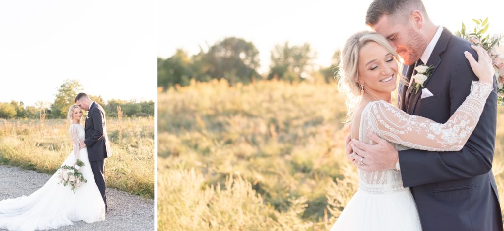
MY FIRST RULE : DO NOT PAIR A VERTICAL IMAGE WITH A HORIZONTAL
WHY? This makes your vertical image so small on the blog! We can’t see it! Every time I see blog posts with images side by side like this, I always always always wish I could see that vertical image larger! Plus it takes away the IMPACT of the horizontal image. The negative space in the right image is purposeful because there is nothing over there and that negative space is less impactful when there is something to focus on to the left.
LAYING OUT YOUR BLOG POSTS the way I describe in this post not only enhances the way your current and future clients view your images but also showcases your work as more high-end and in turn is perceived higher value!
On high-end wedding blogs, images are styled in one of three ways:
- Single horizontal (landscape) image
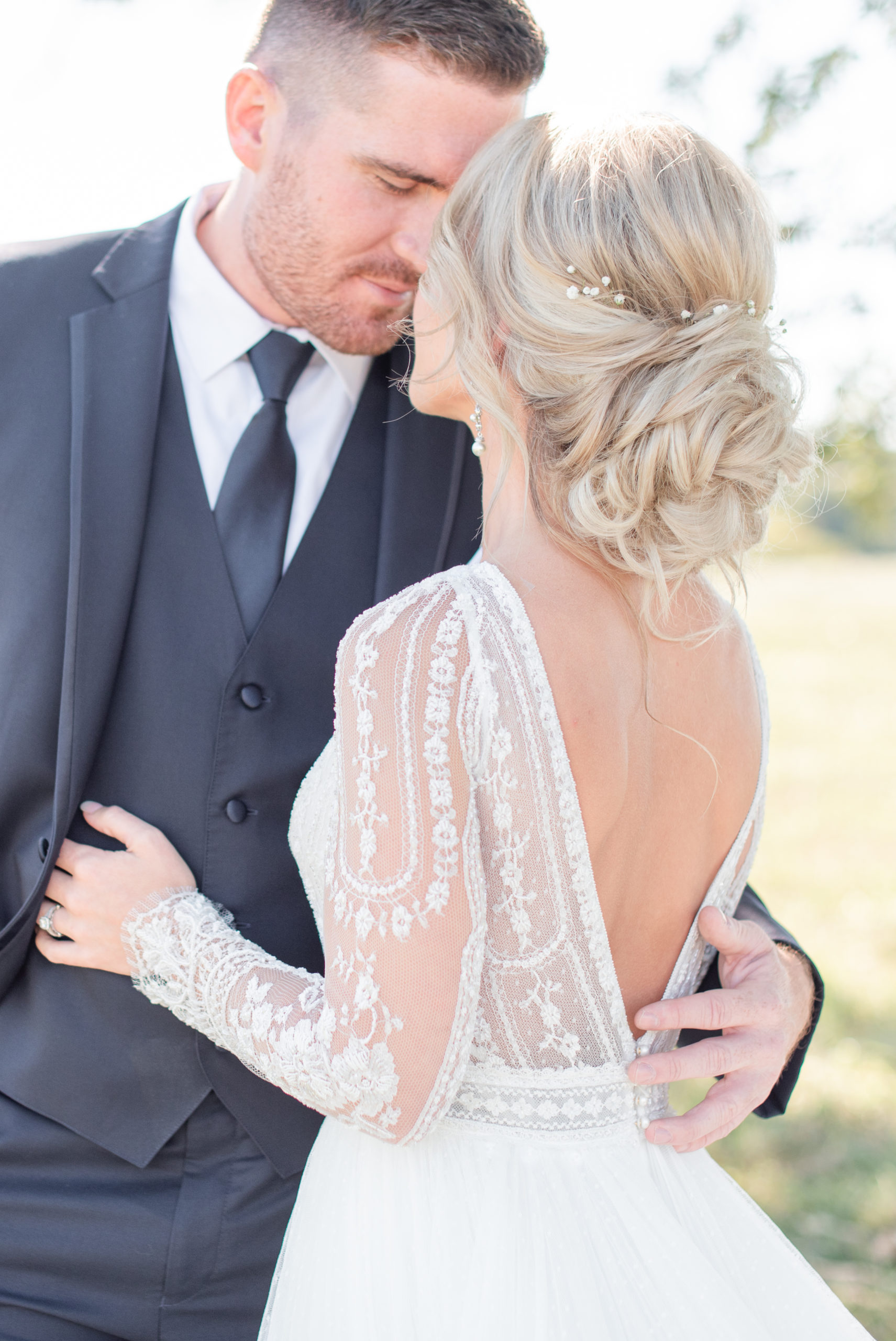
- Two vertical (portrait) images paired side-by-side
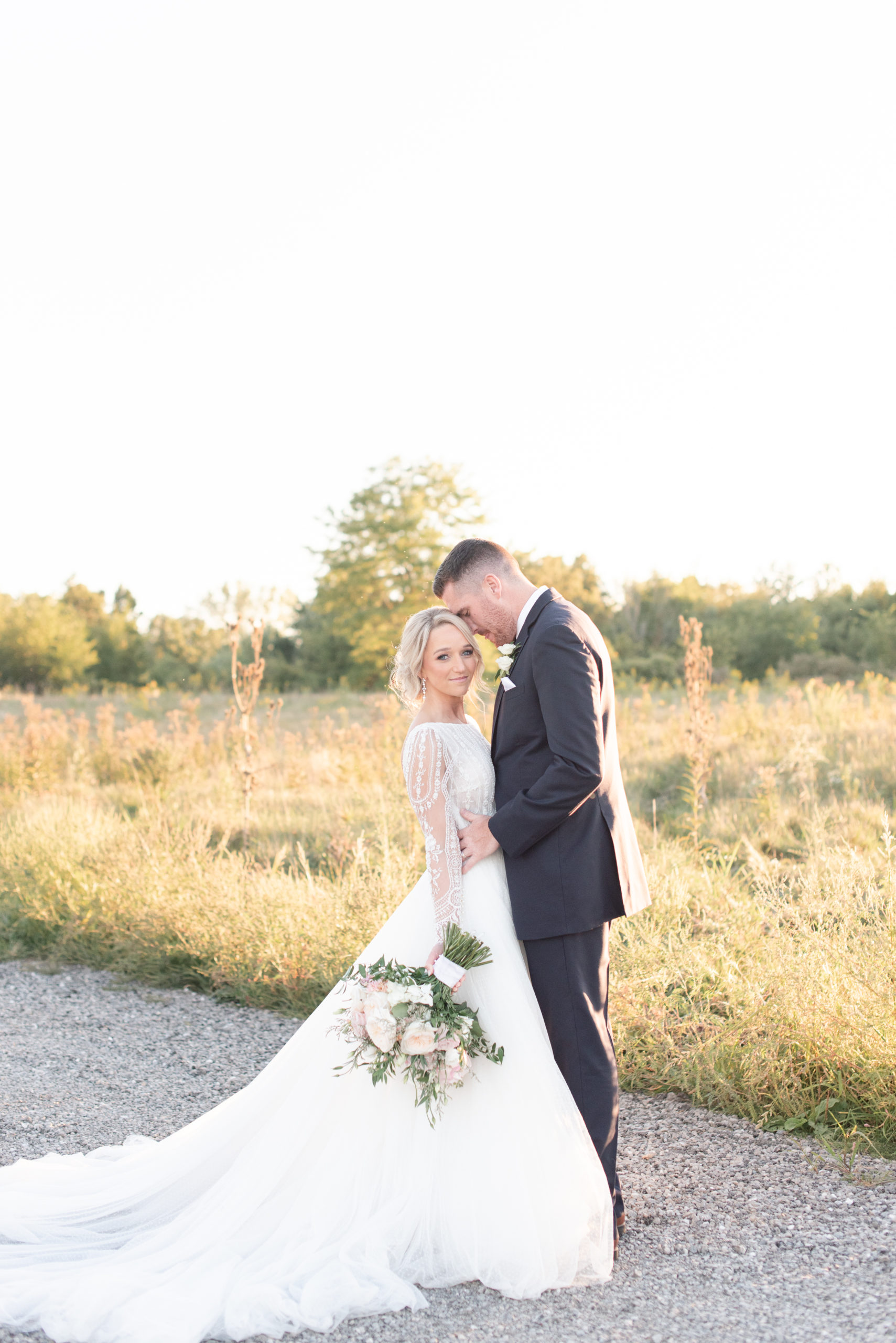
- Single vertical image
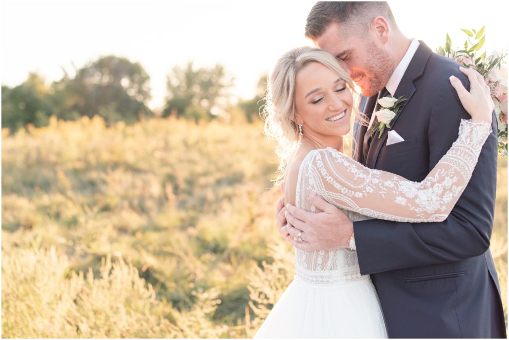
You can see the impact of this style in all of my blog posts!
Here are a few of my favorites to check out:
Rosy Blush Sunset Wedding | Colorful Summer Wedding | Blush Alpaca Farm Wedding
When I’m pairing my blog images, there are a few rules I follow: Composition, Emotion & Edges
RULE #1 // COMPOSITION
In this example, this photo pairing isn’t the best because aesthetically our eyes interpret that we’re seeing the same image. With the subject in the bottom third with negative space above in both images, our eyes just don’t see anything really special about either and will miss the impact of the images. Here are better pairings:
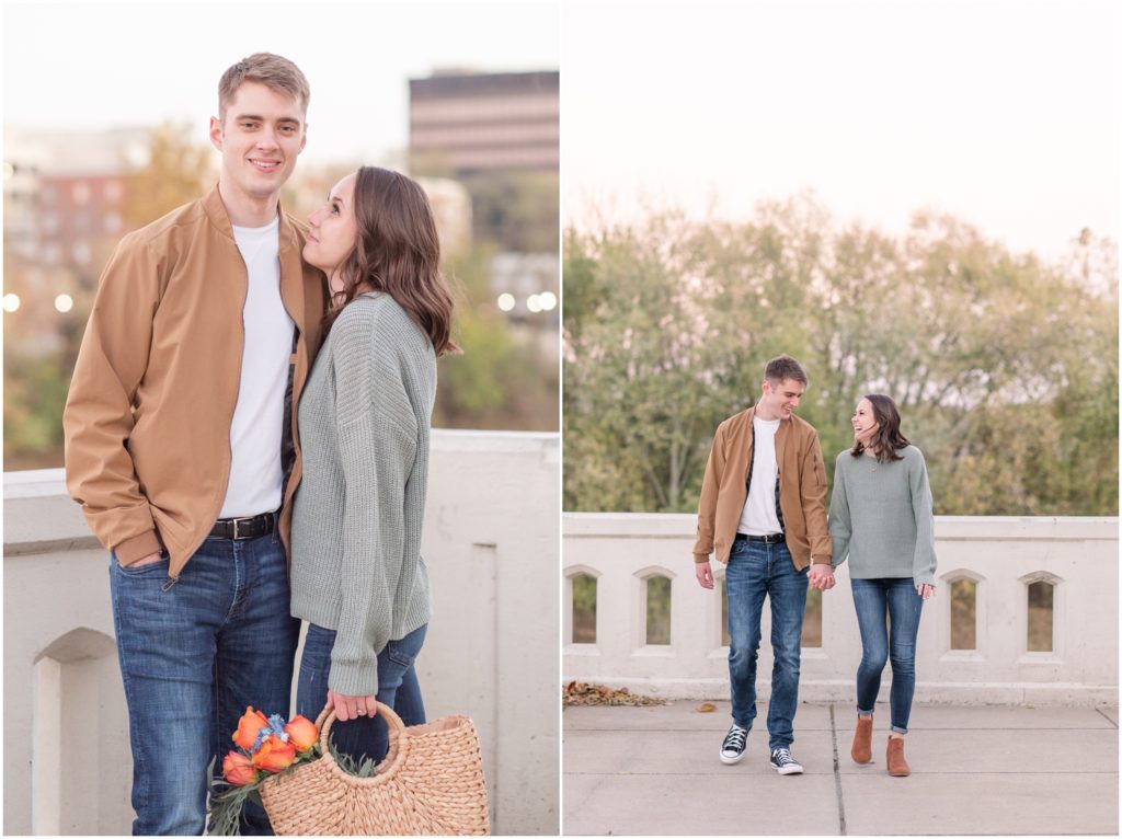
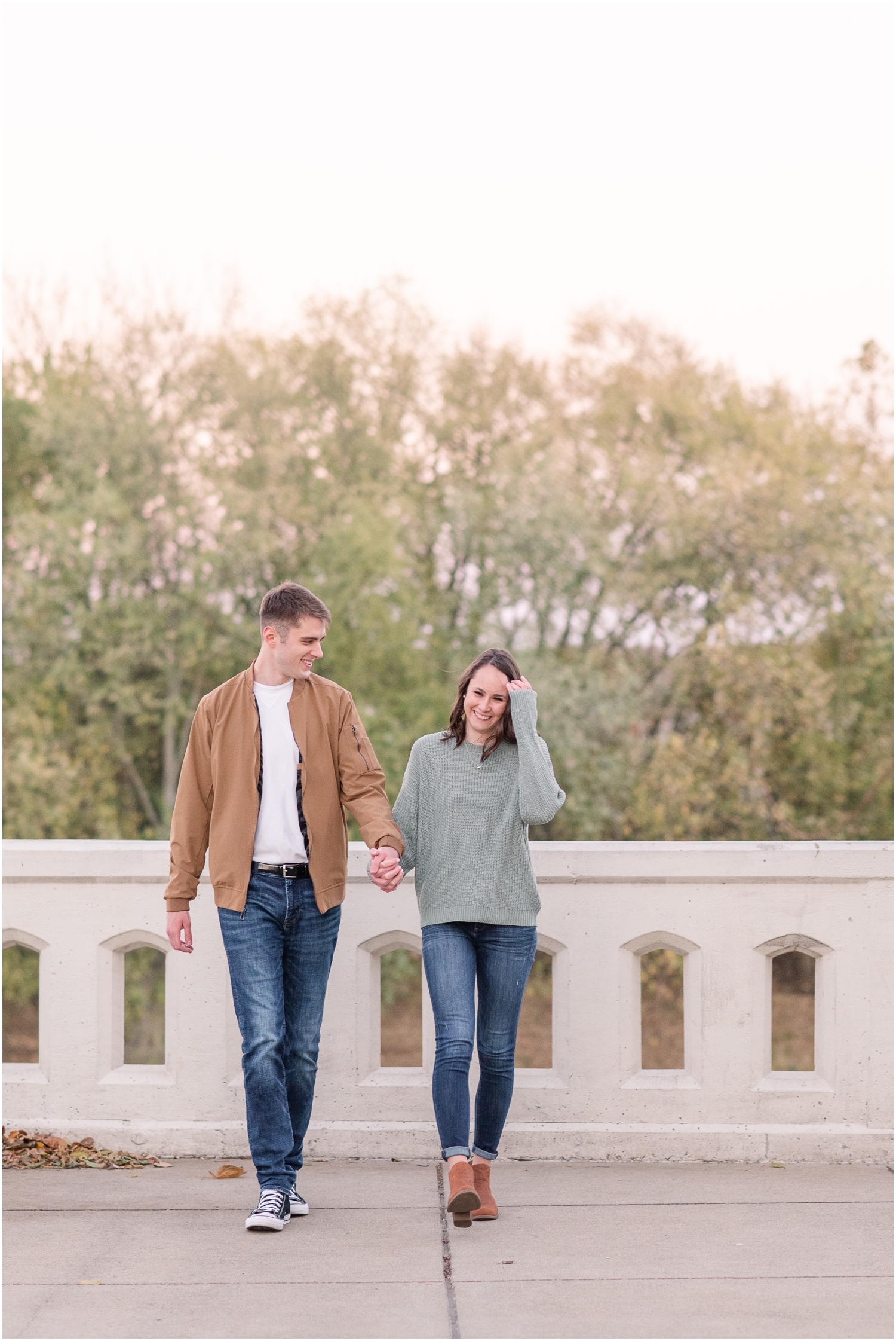
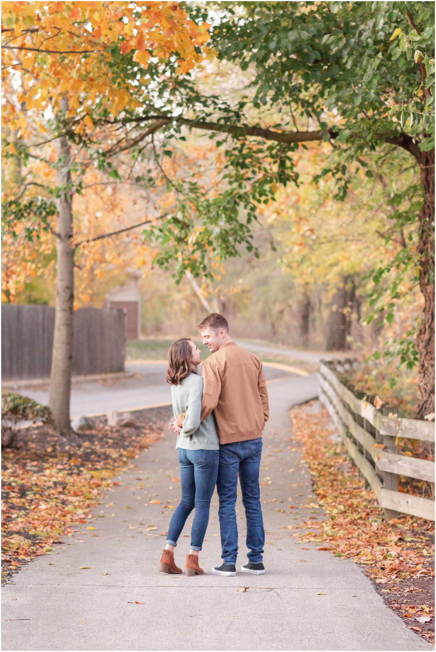
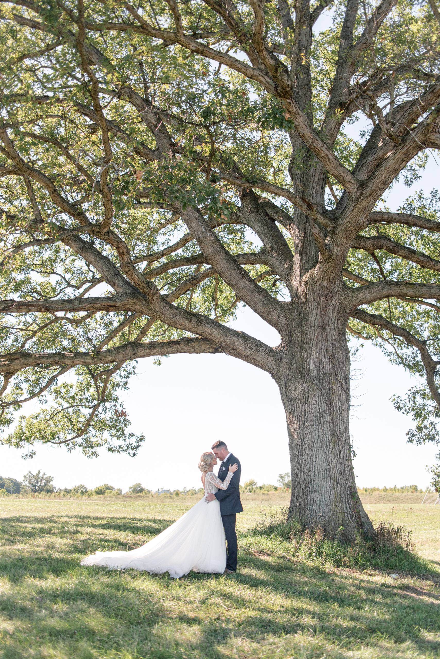
By pairing a tighter shot next to a wide shot, our eyes are drawn to the tight photo on the left and our eyes LOVE the “breathing room” of the wide shot with the negative space above the couple.
RULE #2 // EMOTION
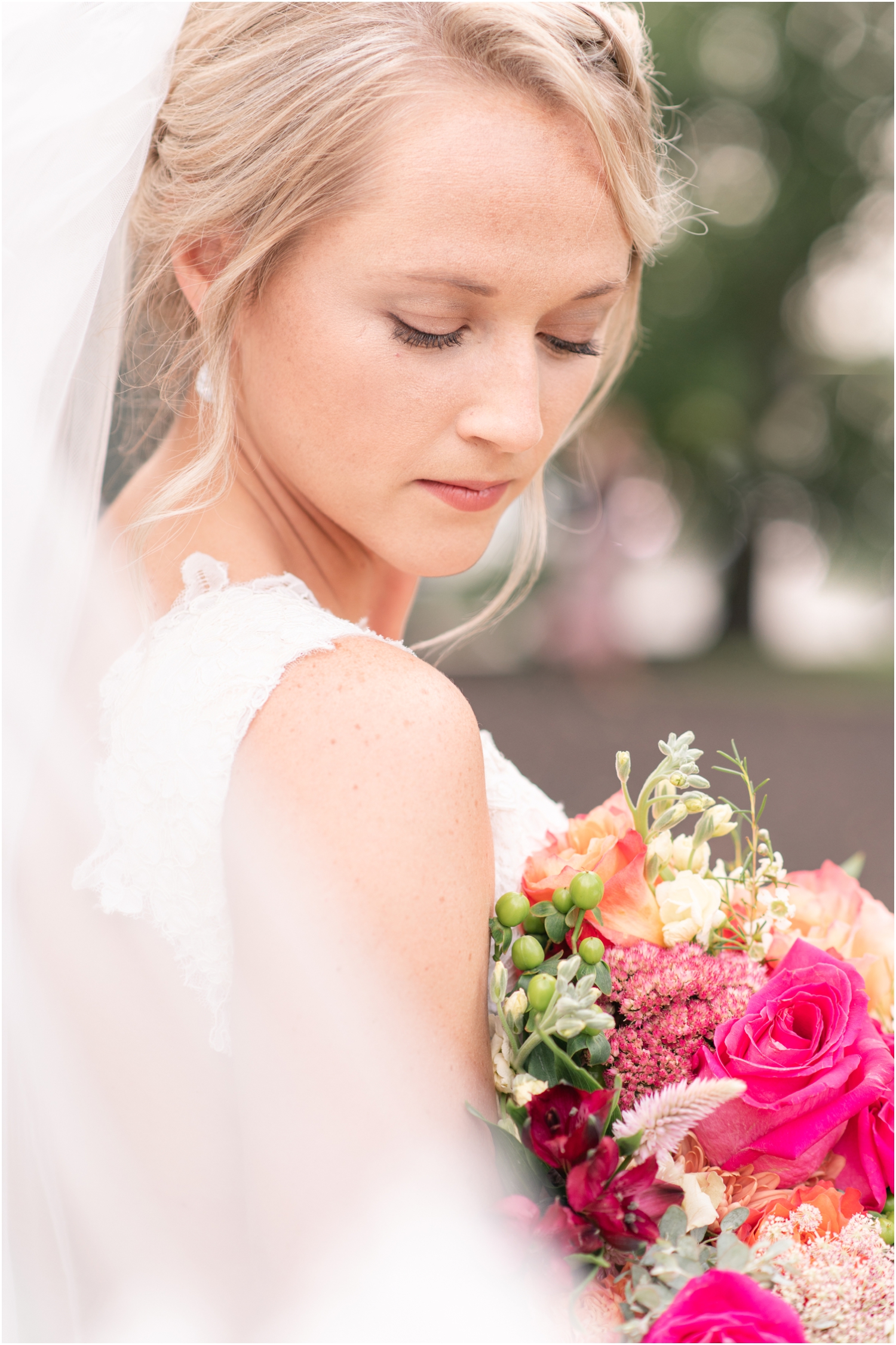
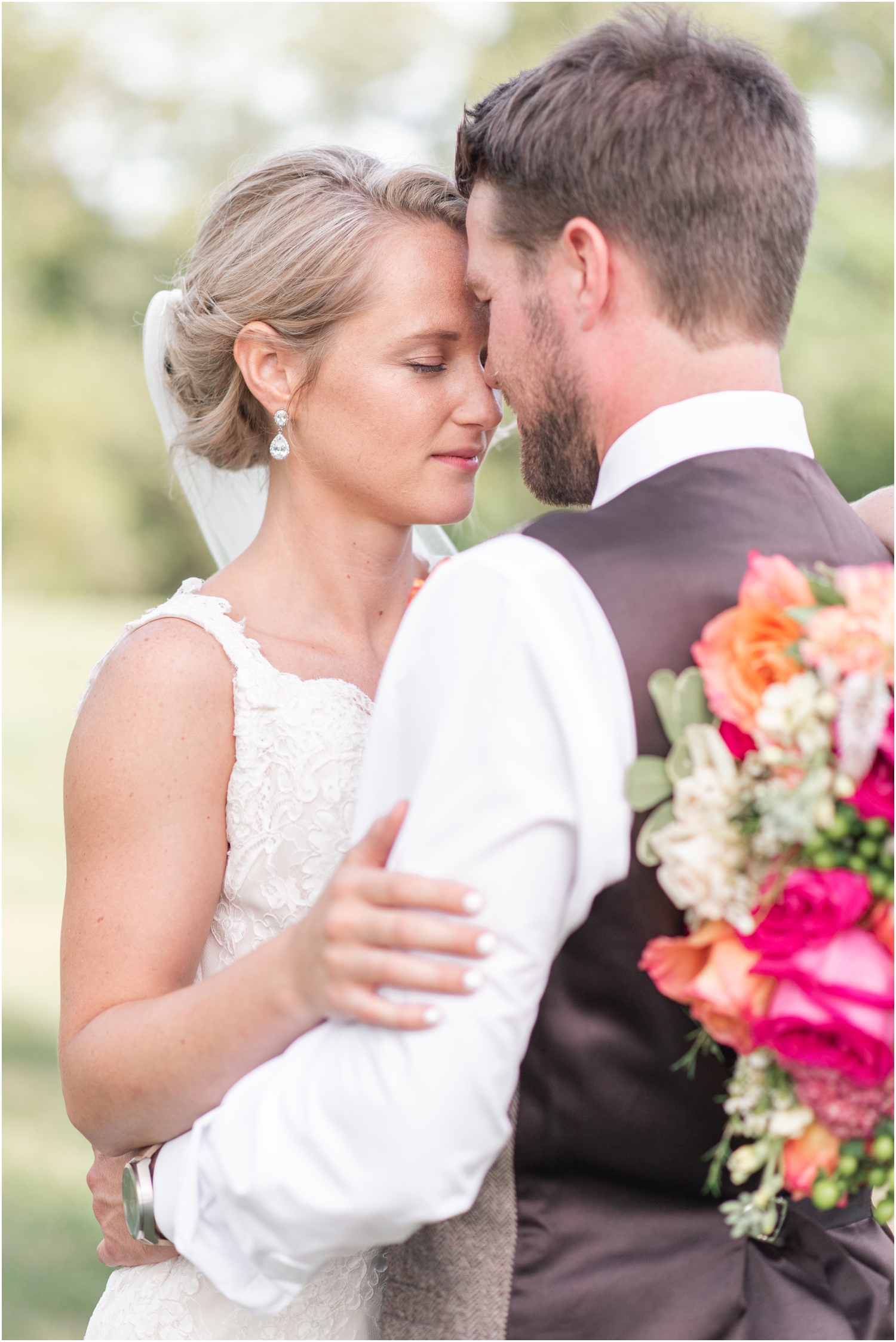
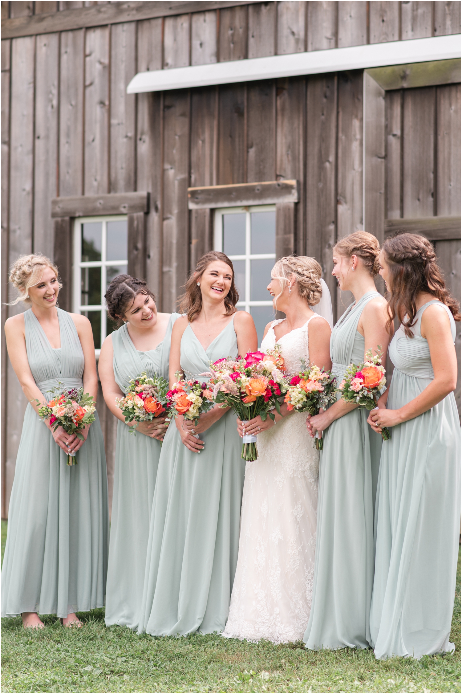
This pairing hits the “same composition” AND “same facial expression” no-no’s! The focal point in each of these images is in the top third of the image AND she has a soft, romantic expression in both. These two together just look like the same image. Here is a better pairing for these photos:
In the preferred pairing, the laughter and joy in one balance out the romantic, serious, model-like expression in the other. I love these pairings much better because they’re also in the same light so the colors are even!
RULE #3 // EDGES
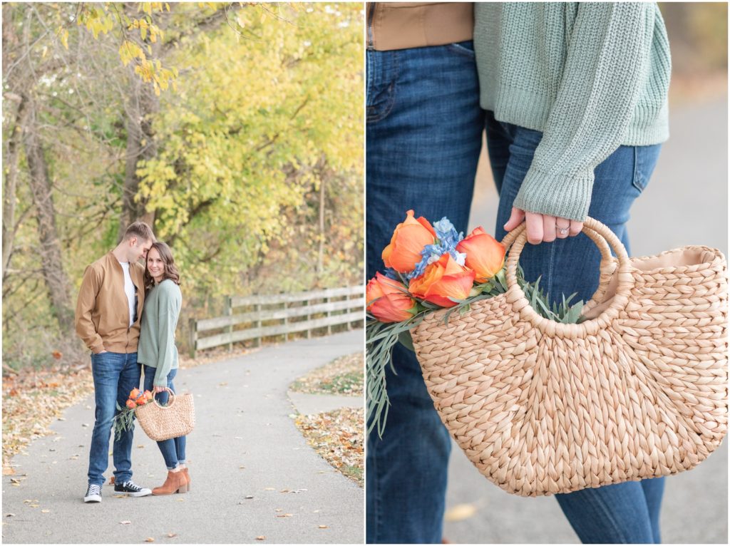
The edges on these two images are both pretty busy. In the left image, we have all the flowers against the tree’s branches. Although this follows the composition rule perfectly, there is a much better way to clean up this pairing.
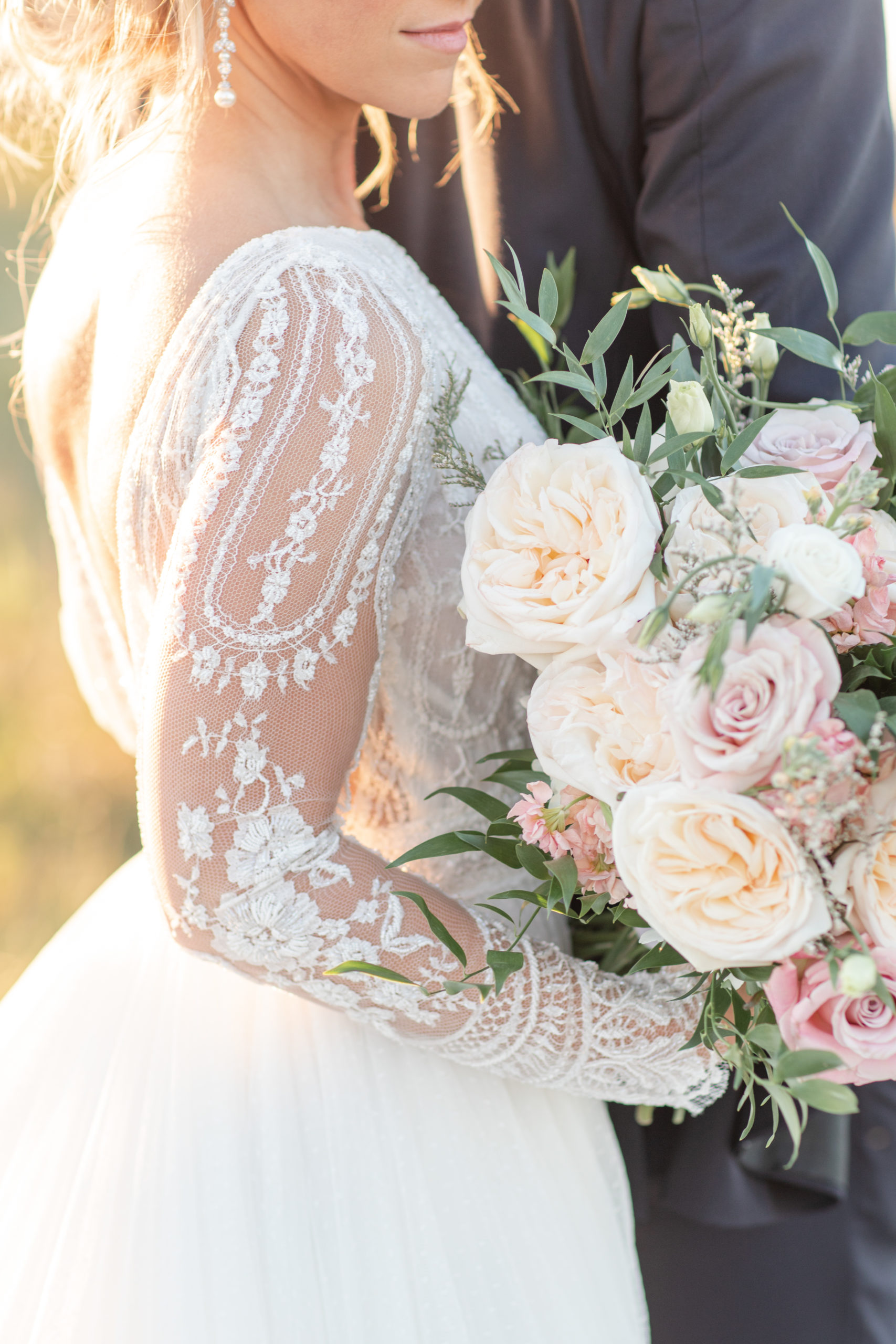
Here is a GOOD EXAMPLE of this rule:
This pairing is so much better! The clean edge of his jacket against the busy, high-frequency edge of the left image creates a great balance. Because I’m such a stickler about my blog photo curation, the way I shoot on location has been affected in all the best ways. This helps me create more variety in my clients’ galleries!
READ NEXT
Wedding Photographer Workflows: The Importance of the Post-Wedding Blog
READ NEXT
My Client Management Software for a Better Client Experience

Did you like this post? Pin to reference the next time you blog!

Have questions or thoughts on this post? Let’s connect!
Leave a comment. I read and reply to every single one! Or even better, follow me on Instagram! I LOVE to connect with fellow photographers on a more personal level on IG. Let’s be friends! I reply to every DM and comment!
Courtney is an Indiana Wedding Photographer and Educator. Her specialty is fun, colorful & playfully romantic wedding photography for classic and timeless couples and branding photography for boss business owners looking to enhance their overall brand with compelling imagery that tells their story. Within Indiana, she serves Fort Wayne, Indianapolis, Carmel, Noblesville, Zionsville, Lafayette, Bloomington and South Bend. Areas in surrounding states that she serves: Columbus, Dayton, Cleveland, and Cincinnati, Ohio; Ann Arbor, Battle Creek and Grand Rapids, Michigan. She is available for destination weddings, engagements, and branding sessions. Contact her for more detailed pricing.
That one couple is totally dressed to blend in with their surroundings. Was that on purpose? Well, nice article and good advice.
So interesting to read about the way you pair photos. I rarely pair photos in blogs, possibly because I rarely shoot verticals. Not sure. Now, you have me thinking about. 🙂
oh my gosh, I almost shoot all verticals, it’s something I’m trying to work on!
I respect the insightful content and precious resources observed on the website. The focus on photographer education, advertising tips, and photo styling is truly beneficial for those looking to beautify their skills and expertise in the industry.
Great tips. I think I will use the photo layout on my next blog.
Wonderful! I know it will make a difference in your blog!
Great tips! Your pairings are lovely!
Thank you so much Mandy!
Thank you so much for these great tips!!!
My pleasure, Ashley! I hope it helped!